 |
The GG Diagram |
|
The GG Diagram |
The following article was written in November 1996, documenting some vehicle performance testing undertaken based around a Porsche 928 S. The article was intended to describe the aims and the underlying theory of the tests performed. The article was written by John McIver, principle of Temporal Images. |
Just as the performance of an aircraft can be described by a flight envelope, so the performance of a car can be described by a graph called a GG Diagram.
A flight envelope is used to describe the regions where an aircraft can and cannot operate, on a graphical plot of altitude against airspeed. Cars are slightly different to aircraft, as they do not normally change altitude....unless you're having a very bad day.
To define a useful performance envelope for an automotive application we need to use some different parameters. It transpires that a graphical plot of lateral versus longitudinal acceleration provides what we require.
Why is this ? Wouldn't a graph involving speed or distance be more useful ? According to the laws of physics, force is equal to mass times acceleration, and a car travelling at high speed has a great many forces acting on it, due to acceleration, braking (negative acceleration) and cornering (lateral acceleration). Acceleration is therefore a very useful parameters to use, managing to tie together speed with the forces which may be acting on a car at any time.
As the acceleration shown on the graph is usually measured in units of G, this plot is called a GG Diagram, as it plots values of G against G. Figure 1 shows such a diagram. The concept of the GG Diagram has been around for a while, arising from automotive research in the United States, initially in 1958. Publication of articles about the concept did not appear until the early 1970's, and is still not widely known in the general automotive community.
So what is a G ? It is in fact a very useful way of generically measuring acceleration. Acceleration is the change in speed with time, and would typically be measured in units of, for example, metres per second per second. That is, how much your speed (in metres per second) changed in a given time (one second). The determination of force requires that a mass (weight) is also known, so your acceleration will change as the weight of your car changes, and you may not know this weight to begin with.
The G manages to remove the issue of weight by comparing measured accelerations with the acceleration due to gravity, which is a reasonably constant value (9.8066 metres per second per second, though it varies slightly with location). The result is a number which has no dimensions; it is unitless. It is the same regardless of whether you are using metric or imperial units. You also don't need to know the weight of your car.
Acceleration is generally measured using an electro-mechanical device called an Accelerometer. We all have a vertical acceleration of one G acting on us due to the Earth's gravity. Formula One cars claim to be able to reach up to 3.5 G under acceleration and cornering, and nearly 2 G under acceleration, while Military jets can reach 9 G, although the pilot may not wish to remain in this situation for very long. On a more accessible level, a sports car on road tyres is unlikely to reach one G in cornering or under braking, though values of around 0.8 to 0.9 G are quite achievable.
Let us now look in a little more detail at what the GG diagram (Figure 1) is telling us.
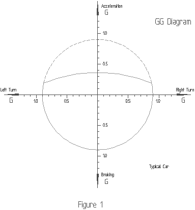
The most basic concept of car handling is that a tyre exerts a grip on the road. It is important to note that the grip exerted is fairly well uniform in all directions. The grip available under braking is virtually the same as the grip available during cornering. This grip can be measured in terms of acceleration (G). Assuming a car capable of 0.9 G (as shown in Figure 1), this turns out to be a graph of what is approximately a circle. The car can turn left at up to 0.9 G, brake at up to 0.9 G or turn right at up to 0.9 G, limited primarily by the grip between the tyres and the road surface. The suspension does have an effect in all this, but it's main function here is to help the tyres generate the grip they are potentially capable of.
Under forward acceleration things are slightly different, as limiting factors other than tyre grip come into play. While in a low gear you may be able to spin the wheels, in higher gears the available engine power becomes the limiting factor. As shown in Figure 1, this presents itself as a distortion of the circle presented on the GG Diagram. The dashed line is what we might like to have, but the full line is what we actually get.
The GG Diagram therefore represents the performance envelope for a car. You can safely operate anywhere within this envelope. The envelope itself is the range of points where the tyres reach their available grip. Outside this envelope you can still operate, but not for very long, as you will be in a dynamic and fundamentally unstable condition.
To now put the GG Diagram into a more practical context, consider Figure 2. This GG Diagram, based on live test data, compares the operating envelopes of 2 very different cars.
The inner envelope is that of a 1978 Toyota Celica, fitted with long-life radial tyres. The outer envelope is of a Porsche 928S fitted with soft compound road tyres. Both envelopes were recorded using the same accelerometer test equipment, with the Porsche data being collected on the 29th of September at the Porsche Car Club President's Day at Sandown Motor Raceway.
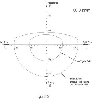
The most obvious feature of this GG Diagram is the substantially larger envelope enjoyed by the Porsche. The use of high performance tyres is apparent from the fact braking and cornering accelerations exceed a value of one G. If fitted with more conventional road tyres one could expect G values to drop to, perhaps, 0.95 G. In the case of the Toyota, tyre grip has been sacrificed for durability. The tyres here have been used for over 60,000 kilometres, and still have some life left, so they are definitely not in any way "sticky".
Figure 2 is a very dramatic example of the effect tyres can have on a car's overall performance. It shows how the grip of the tyres is a crucial factor in performance, and what you may be getting when you pay that little bit extra for high performance tyres.
Under acceleration things are a little closer, though the true Porsche performance is probably masked by the test car having an automatic transmission. Dedicated acceleration runs were not performed, so the real acceleration limit could be slightly higher. The Toyota was fitted with a manual transmission, with dedicated acceleration runs being performed, though using a relatively low 4000 rpm shift point.
The GG Diagram can be used for several practical purposes. As we've just seen, one of these is to define the performance envelope of a car. Such envelopes can then be used as the basis for comparing different cars. They can also be used to compare drivers, or refine the abilities of a driver in a particular car.
Figure 3 presents a GG Diagram displaying 8 minutes of recorded accelerometer data around Sandown Motor Raceway. Data was recorded at 10 samples per second to generate the trace shown. The car's performance envelope is also overlaid. Although initially appearing as a meaningless tangle of lines, a number of interesting things can be read from this chart.
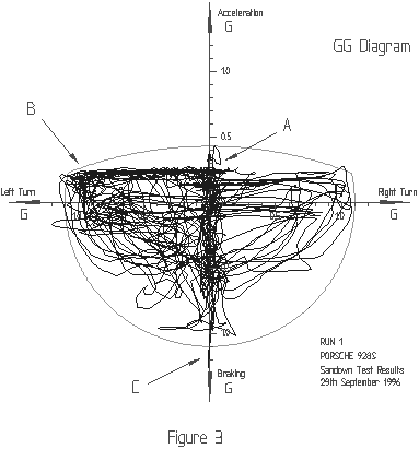
Three particular points have been highlighted. Point A is a small spike of forward acceleration above what appears to be a fairly consistent horizontal boundary. The recording of the acceleration data commenced before the car began moving. This spike represents the acceleration of the car away from rest. Once moving, particularly around a high speed circuit like Sandown, the car has less acceleration capability. It is operating in a region where it cannot attain as high a forward acceleration. This is the reason for the apparent boundary of forward accleration shown on the diagram.
Point B highlights that there is far more data displayed on the left side of the GG Diagram than the right. This is not surprising as Sandown is made up primarily of left hand corners, so a car will spend much more time turning left than right. It is also apparent that data occasionally appears beyond the curve defining the performance envelope. The performance envelope indicates the sustained capabilities of a vehicle. Dynamic manoevres can exceed these capabilities, though only briefly.
Point C indicates a spike arising from a dedicated maximum braking manoevre, executed specifically to obtain an extreme value on the GG Diagram for later analysis. It's interesting to contemplate whether this is a point arising from a dynamic manoevre, or a sustained deceleration point, or some combination of both. The point itself peaked at a deceleration value of 1.25 G, which is quite an impressive figure for a road car.
Figure 4 displays another GG Diagram recorded at Sandown. This shows a number of similarities to Figure 3, and also a number of interesting differences. This diagram clearly indicates a very useful aspect of the GG Diagram; how it can display where a driver or car can be improved to better utilise the capabilities available. Two hatched area, labelled A, indicate areas of the diagram where very little of the recorded data appears.
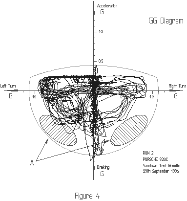
So, what are these areas ? These represent a region where the car would be braking into a corner. One of the classic rules of high performance driving is that one should never brake and turn at the same time, yet the GG Diagram is telling us to do just that. This is one of the more fascinating features of the GG Diagram. It leads us to re-evaluate how to approach the task of driving rapidly. It has resulted in two fundamentally different approaches to driving being proposed, which some have termed "The European Method" and "The American Method".
To best explain them, consider the illustration shown in Figure 5, which is a generic hairpin turn with long straights approaching and leaving it. The obvious procedure for this turn is to brake prior to it, enter, turn into the apex, then accelerate away. Let us consider how to negotiate this turn, by way of the GG Diagram, using each of the two methods. Our explanation, and the accompanying diagrams will be exaggerated somewhat in order to make the differences as clear as possible.
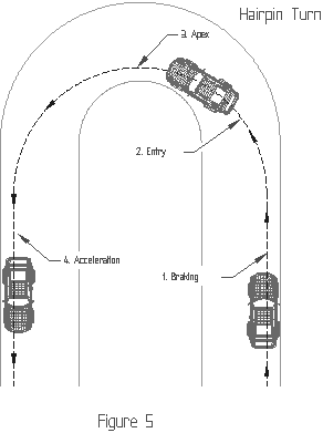
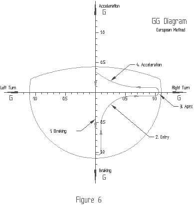
First, "The European Method". This is the classic driving style which most people are aware of, or have been taught. This is where everything is done in sequence, and you never brake and turn at the same time, for fear of de-stabilising the car. Figure 6 displays an idealised GG Diagram for this, with the various elements of the corner labelled. You approach the corner at speed, braking at the end of the straight (Point 1). You come off the brakes as you turn into the corner (Point 2), building up to the limit of your tyre's grip (Point 3). At some distance beyond the apex you accelerate away (Point 4). As mentioned, we are exaggerating things a little here, but you will notice the test data displayed in the GG Diagram of Figure 4 is not that much different from the idealised trace of Figure 6.
What we are showing here is that we are not utilising the full tyre grip available to us all the way through the corner, and the area where this is most apparent is in the entry to the corner.
Now, let us consider "The American Method". This approach has developed as a result of what we have just seen, with the specific intention of utilising the car's capabilities more fully. Here, as before, we brake at the end of the straight. We come off the brakes partially as we turn into the corner, easing off further as we track toward the apex, and as the lateral acceleration builds up.
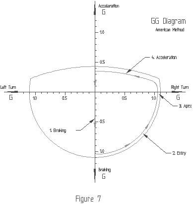
Effectively, the tyre has a fixed level of grip and we are trying to perform a smooth transition from full deceleration (only longitudinal deceleration and no lateral acceleration) to maximum cornering (only lateral acceleration with minimal longitudinal acceleration). In this transition phase we should have both lateral and longitudinal accelerations present, combining together to be equal to the total available tyre grip.
The same principle holds true for acceleration out of the corner as with braking into it. Most drivers already accelerate out of a corner, but few brake into it, so the braking phase is where the greatest gain can be realised.
This procedure, in relation to the GG Diagram, is colloquially known as "filling the circle". The whole objective is to stay away from the centre region of the vehicle performance envelope, as defined by the GG Diagram. The closer you are to the edge of the envelope, the more fully you are utilising a car's available performance capabilities.
There is a down side to this though. The closer you are to the performance limit of a car, the closer you are to potential disaster. With "The European Method", if you leave your braking a little too late, there is still a margin of safety available to recover the situation. With "The American Method" the same situation will result in far less opportunity to recover due to the inherently smaller safety margin.
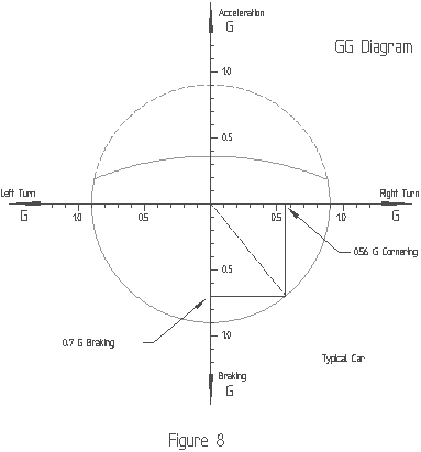
One final point for contemplation as we close, is shown in Figure 8. It is a GG Diagram for our generic car of Figure 1, having a 0.9 G capability under braking and cornering. Now assume we are braking in this car at 0.7 G. This is fairly firm deceleration, though not to the full limit of the car's capabilities. In this condition, how much lateral G is available to use for turning ? Is it 0.2 G; the difference between 0.7 and 0.9 G ? In fact, we are dealing with a circle and the mathematics of trignometry apply. The available lateral acceleration is 0.56 G. You're welcome to check the diagram to verify this is true.
Copyright (C) Temporal Images November 1996
Temporal Images takes no responsibility for any actions taken by any individual resulting from the information presented in this article.
This article may be freely reproduced provided Temporal Images and John McIver are credited as author and the article is presented in whole. The text and illustrations comprising this article are available in electronic form if required
| Copyright (C) 2018 Temporal Images | Email Us | Last Updated: 1st November 2018 |